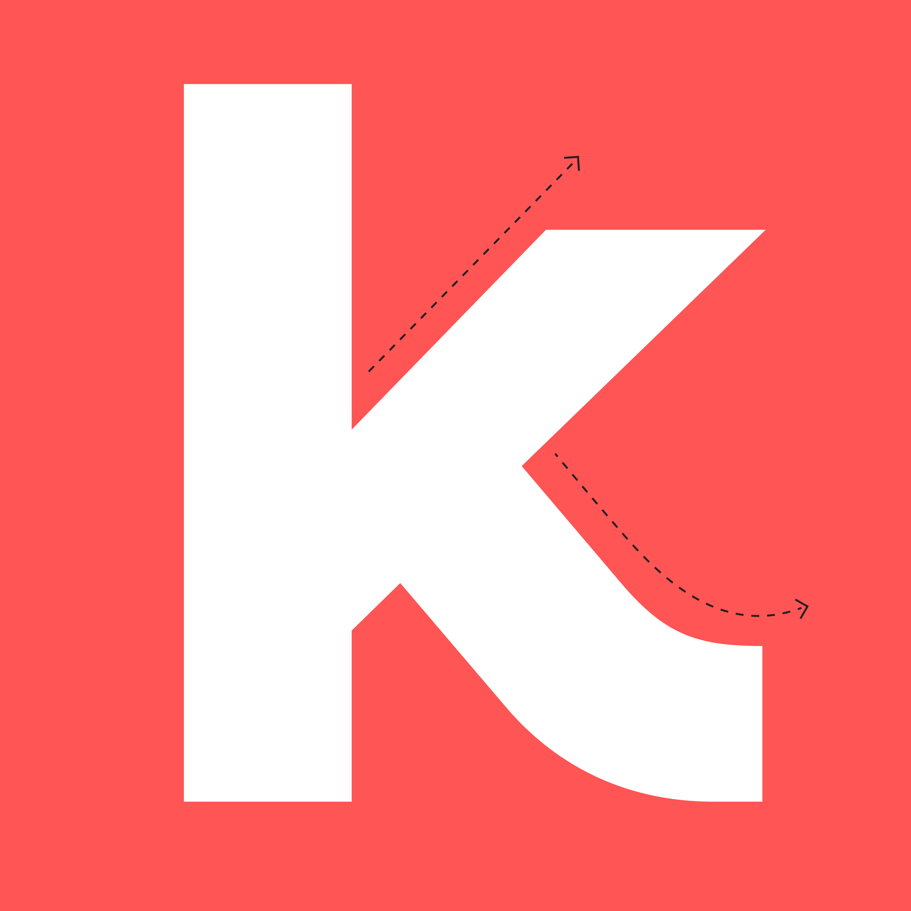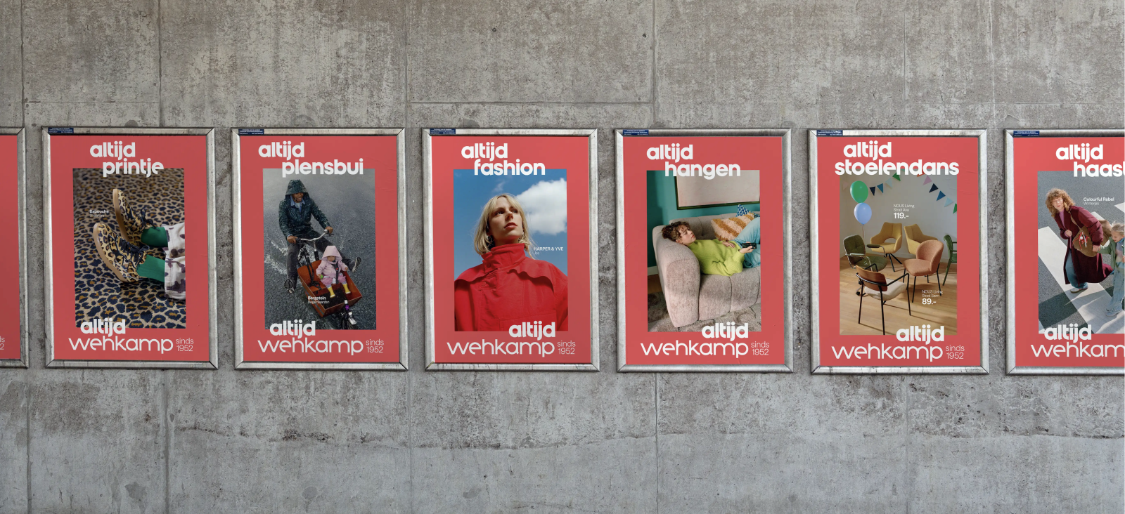
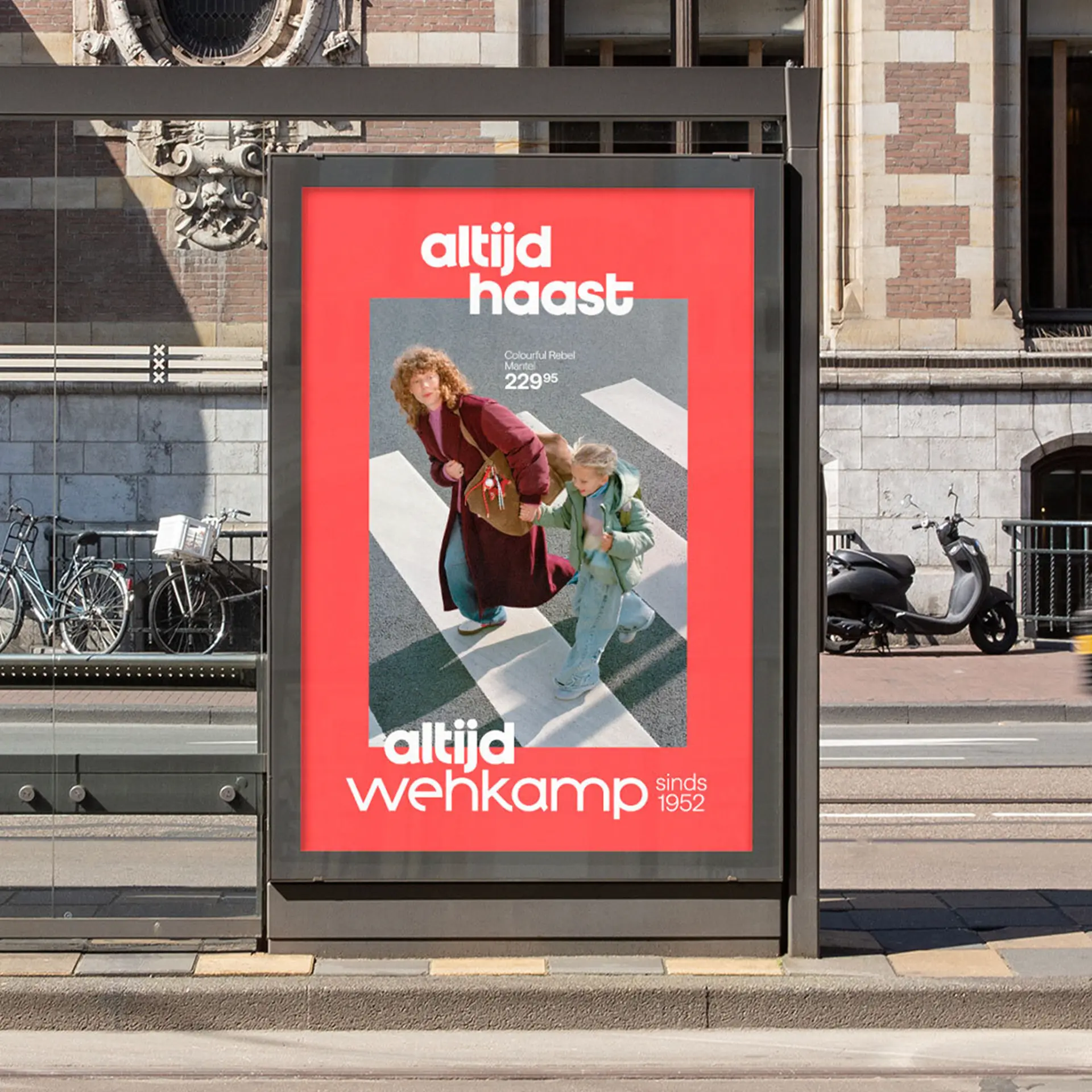
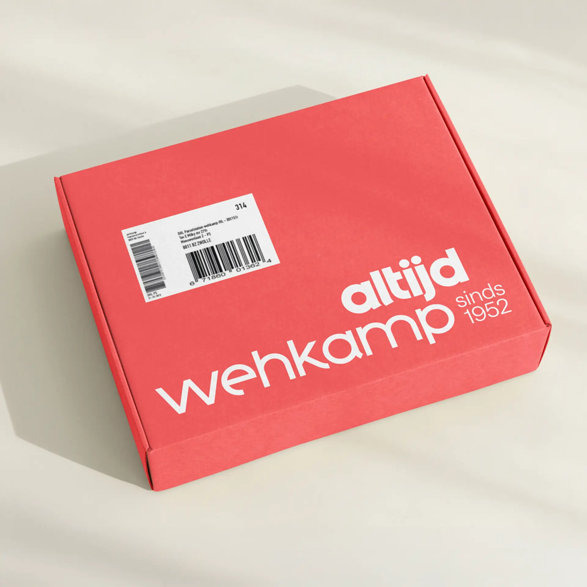
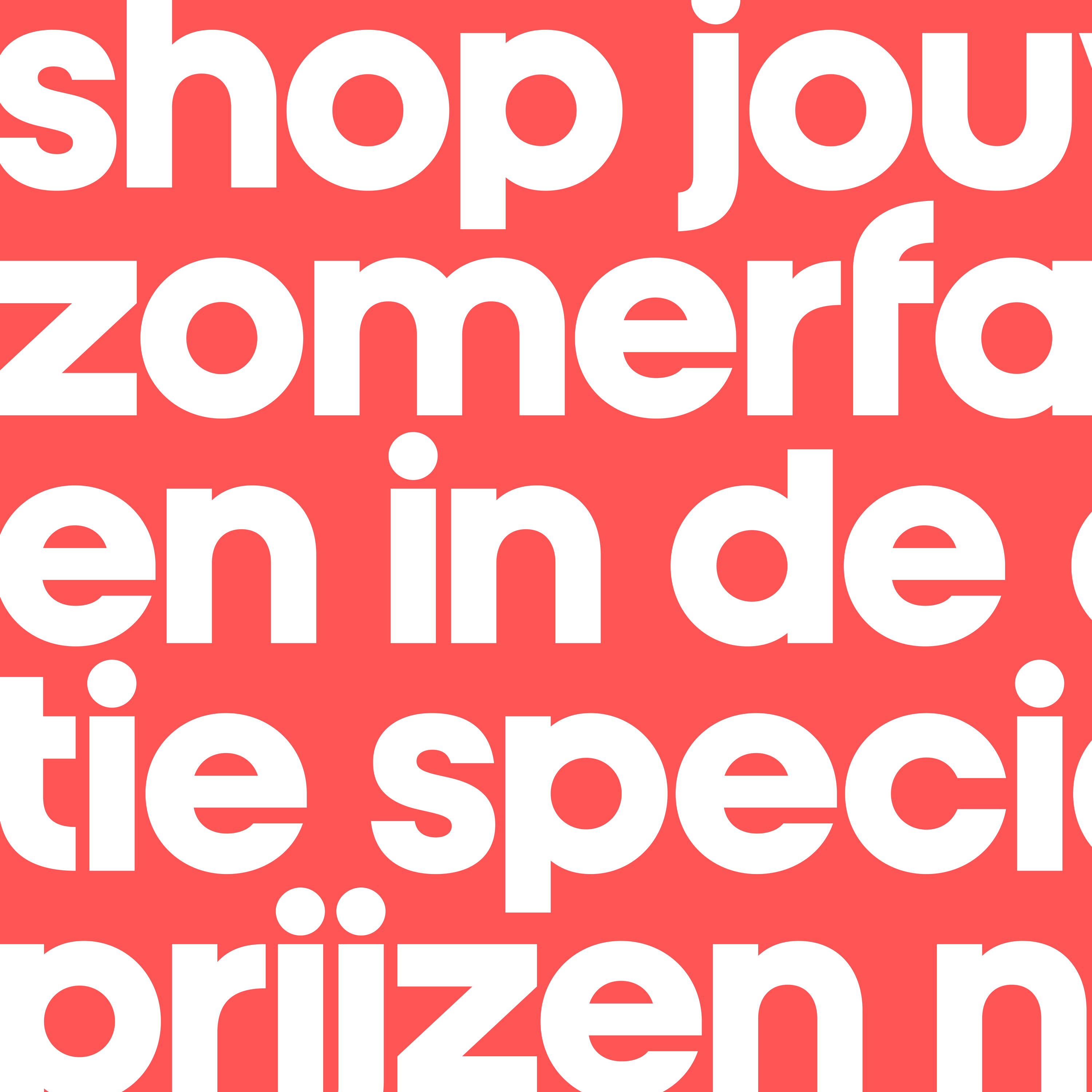
Wehkamp Sans is a bespoke typeface developed for Wehkamp in collaboration with Dawn. Rooted in the retailer's distinctive wordmark, the typeface translates the character of the logo into a versatile system built for every customer touchpoint. Its geometric construction is softened by friendly curves and subtle curled terminals, creating a voice that feels both confident and familiar. A defining feature is the extra-wide W, echoing the proportions of the iconic logo and giving the typeface an unmistakable identity. Carefully balanced spacing, robust proportions, and excellent legibility ensure the family performs seamlessly across e-commerce, editorial content, and marketing, providing Wehkamp with a cohesive typographic foundation that honours its heritage while supporting the needs of a contemporary retail brand. Wehkamp Sans includes two styles: Regular and Bold.
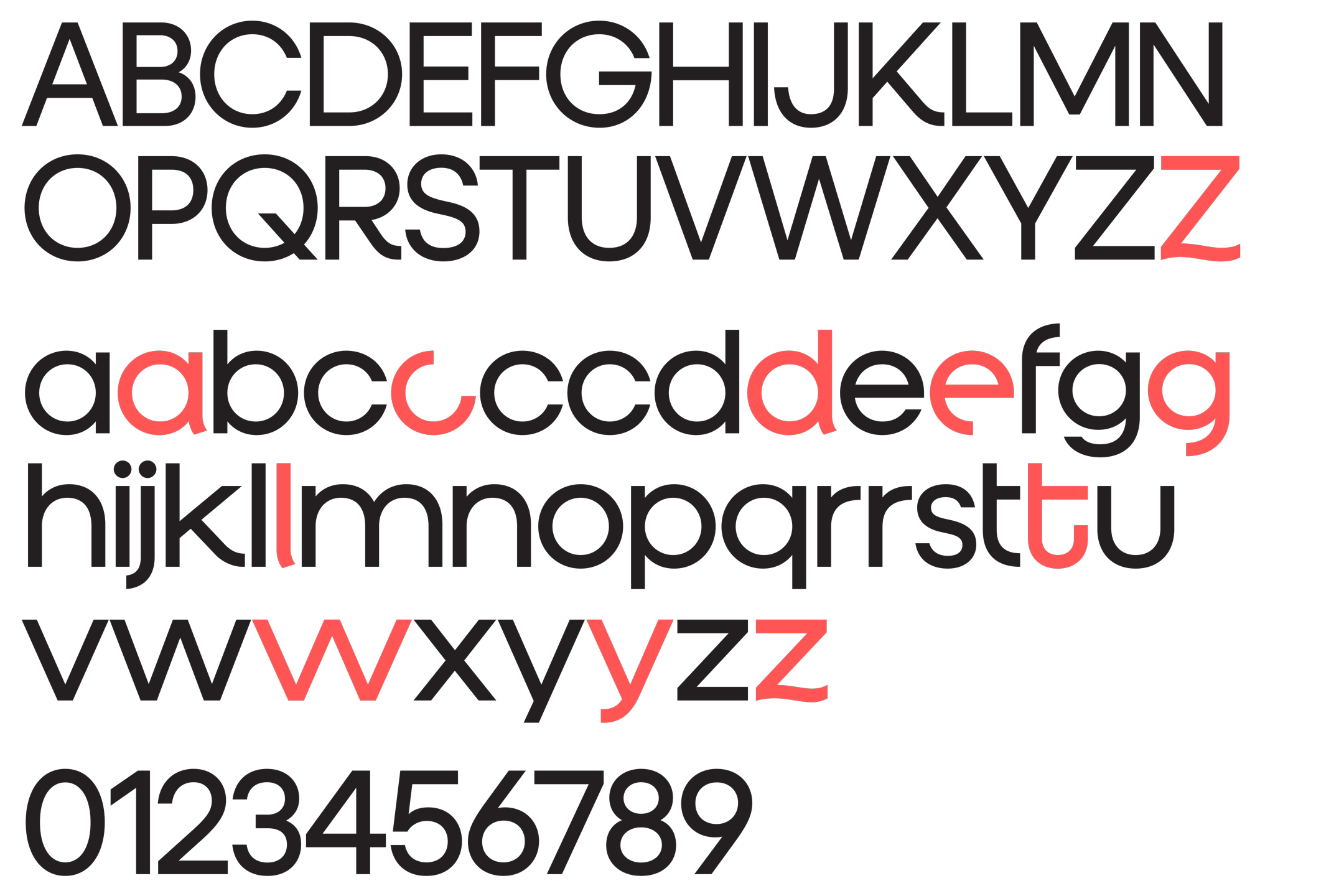
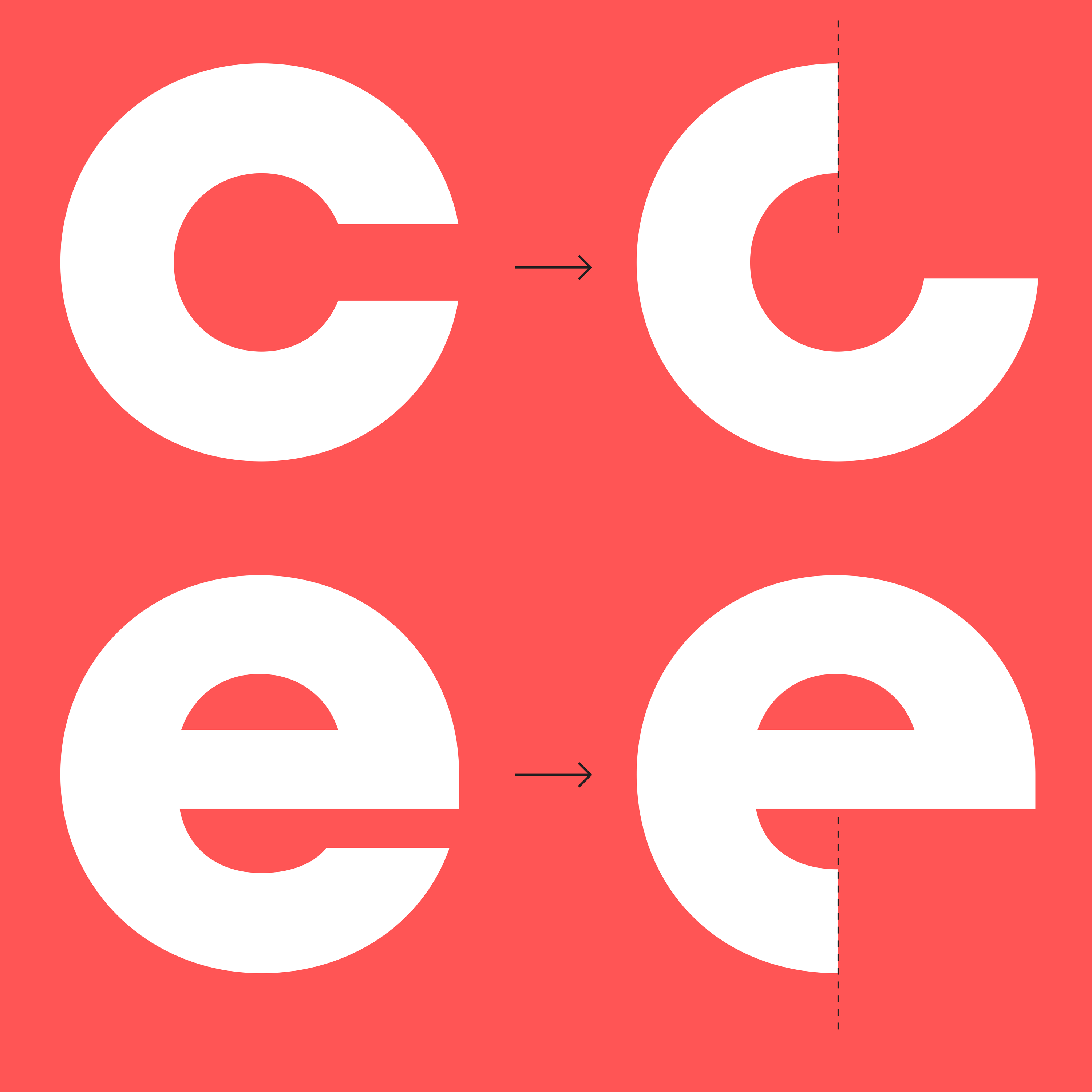
Wehkamp Sans features a set of OpenType stylistic alternates with cut-off terminals inspired by the geometry of the Wehkamp logo. These optional glyphs allow designers to reinforce the brand's distinctive visual language wherever a stronger typographic expression is needed.